Stampede at their rehearsal space, The Jam Dome
3.30.2010
Stampede on Skope Magazine
My article and pictorial on the band Stampede has been posted over at Skope Magazine. The band is gaining momentum as they are poised to release their debut album, Babylon Punk, on April 16th. I was able to hang out with the band on multiple occasions as they recorded their album and rehearsed. The bands live high energy raw live show is definitely something to check out. For more on the band head over to their Myspace.
3.28.2010
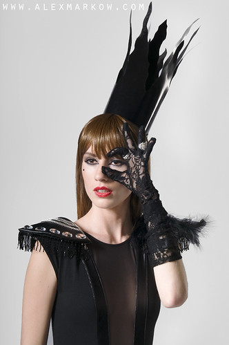
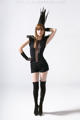
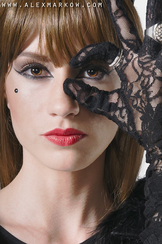
Bad Romance
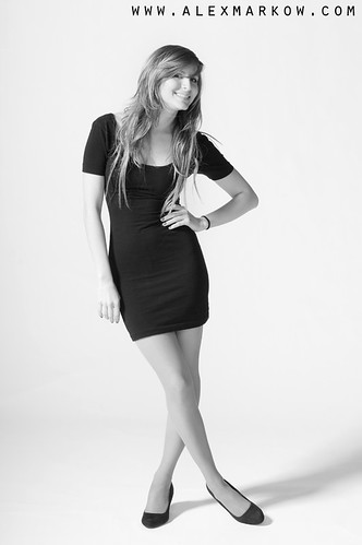
This shoot was styled by Tiffany Azmouz. Tiffany and designer Alejandra Iragorri worked together to put together the outfit. Model Victoria Izturriaga did a great job as we worked to get the shot I wanted.
Sergio helped me out and stood in while I tested my lighting
As I enjoyed my favorite activity, waiting for make up and hair, I had Tiffany take some photos.
3.22.2010
Apollo Vendetta Promo Cover
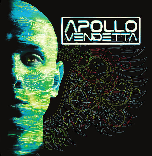
I previously shot Apollo Vendetta during his DJ set opening up for Dubfire at Gryphon. Here is the promo cover put together by graphic designer Joe Brent.
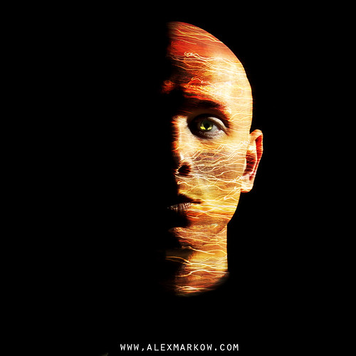
Along with the blue and green light trails, I also gave him the choice of red and yellow.
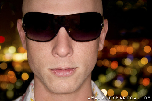
To start, the portrait was shot with a single flash with side lighting. Going into the shoot I thought about maybe doing something in post with backgrounds or overlays so I also took blurred photos of the city lights from the high rise balcony. Using an image of blurred city lights I overlayed them over his face. The vibrant color was created by altering the hue and saturation.
Here are some other shots we took from the balcony with downtown Miami in the background. In the first photo I added city lights in his sunglasses. I thought for the close up it would be a bit cheesy to add lights.
Here's another shot with side lighting , using a wall inside the apartment as background.
3.18.2010
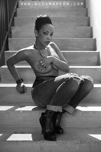
Jeovanie André Styled by Maya Sanchez
The first image was shot in an empty parking lot building that was part of a brand new neighborhood. I'm assuming the barred area will eventually hold golf carts. Anyways, I like being able to pick a composition or angle that opens up opportunities to where an image could take place.
This shot in the stairwell of the parking building was inspired by a shot from a GQ spread with Rihanna.
We shot various looks through the day, with this being the last for Jeovanie. This was shot simply in front of a wall with a shoot thru from camera right and silver reflector on camera right.
This shot in the stairwell of the parking building was inspired by a shot from a GQ spread with Rihanna.
We shot various looks through the day, with this being the last for Jeovanie. This was shot simply in front of a wall with a shoot thru from camera right and silver reflector on camera right.
3.16.2010
Kelmscott Manor Editorial
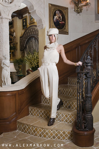
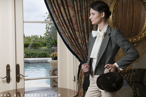
This shoot was styled by Noelle Daly. We were able to shoot at a great house on Deerfield Beach. The house reminded me of a consignment gallery with chairs, tables, sofas, collectables, paintings, and all sorts of things everywhere you looked. For the shots inside, I prefered to limit the amount of different things in the photo. I chose angles to achieve this and moved things if needed. The concept that Noelle put together really worked well with the location. The group shot is my favorite of the shoot and the color palette of the image rocks. Models Katie, Maria, and Julie did a great job and fit the look.
Here are some outtakes that I shot after we were done
3.12.2010
Editorial Portait: Le'tron
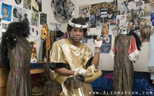
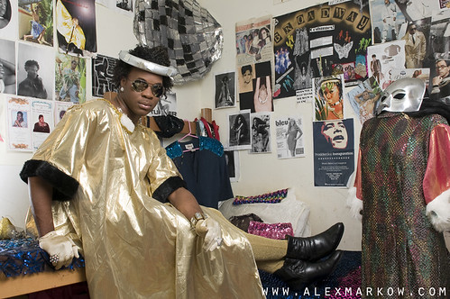
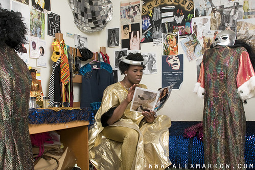
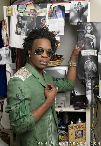
Let me introduce you to Le'tron. He is a fashion designer at my school, The Art Institute of Ft. Lauderdale. His style is eccentric and he has the personality to match. Personally, I love people with character. Le'tron has plenty of it and is completely comfortable with who he is. With out character, life would be boring. I have worked with Le'tron before on shoots for his fashion styling class and it came up one time that he has a sequin bed spread. As soon as I was given the assignment for my editorial class to do an editorial portrait, I thought about shooting Le'tron. My goal was to show Le'tron's style and how colorful he is. I had asked Le'tron to take a picture of his room just to give me an idea of what it looked like and give me the ability to decide if it was the location I wanted to use. Mannequins, a desk covered in sequins, photos of divas and himself all over the walls for a location? It would work. Just to add to the atmosphere, Le'tron played music including Diana Ross, Patti Labelle, and Billie Holiday during the shoot. Just great.
I chose this as my final image
Here are some others
The Beyonce Shrine
During critique in class, we were lucky enough to be joined by the successful editorial photographer Marc Serota. He gave us good insight into what it's like shooting editorial portraits for clients. The number one thing he recommended was to always shoot a cover. No matter what the client initially asks for, always shoot a cover. Just in case the story gets bumped up, you'll have a cover they can use and you'll get the extra coin. It makes sense. The client would rather not hire someone else to shoot a cover when the subject has already been shot.
Assisting Jason Manshie
I got the chance to assist Jason Manshie for a 1920 Men's Swimwear Editorial at Glass House Studios in Miami last week. Jason's been kind enough to give me advice on assisting and photography in general. He tells it like it is, which I like. Here's a video of the shoot that Jason put together. Check out more of his work at Jason Manshie Photography or his Blog.
Lerone
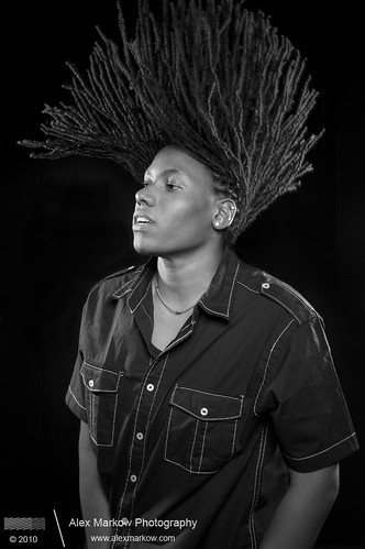
I go to school with Lerone and she asked me to help her out and take some head shots for her resume. Along with the head shots we got creative and got some action shots of her shaking her braids. This is my favorite shot from the portrait session. This is actually a composite of two shots. I used one for the best pose and then another for the best hair.
Subscribe to:
Comments (Atom)


